It’s like instructables – but a lot simpler, with a lot of general scientific building blocks/principles turned into toys etc.


This stuff has so much more imaginative potential than the mountains of injection-moulded crap that turns up in Toysrus. It would be cool to have a similar site which has building blocks of really useful technologies – like using plastic bottles to sterilise water etc. Kindof like a Lifehacker style knowledge-sharing site for the billions of people on this planet who don’t have access to clean water etc.
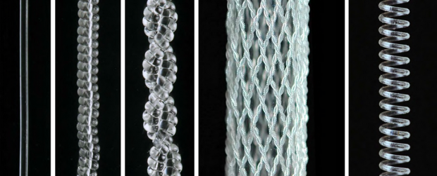 Fishing Line Artificial Muscle
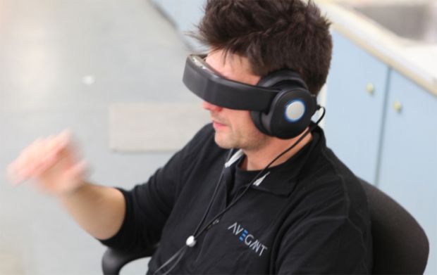 Glyphage
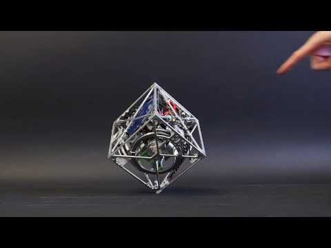 Balancing Cube
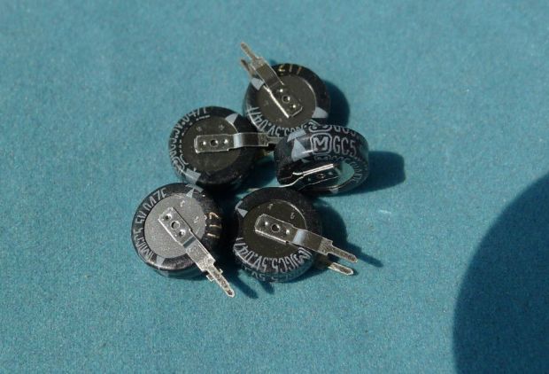 Batteries
 P2P Everything
 Human Hampster Balls
 Midgital Computer
 How to start fires in Ikea
 Robots: Army vs Tabley
 DIY Ball and Socket Joints for Stop-Motion
 On Addiction
 And The Void Mooned Back...
 The Spirit Of The World
 A Machine to Steal Souls
 More Anti Digital
 Thync
Thync Robotic Sensory Loops and Whatnot
 Cartestian Robot Roundup.
 Post-Scarcity Link-Dump
 Servo Bender
oh you mean like http://appropedia.org ?
The http://www.arvindguptatoys.com/toys.html site has some general toys, whereas Appropedia would probably only host sustainability focused ones like the http://www.appropedia.org/Bamboo_demonstration_motor.
Thanks for the shout out Fenn!
Oh indeed – appropedia is great, and architecturally (being a wiki) has more scope/potential than an owner-run site.
Part of what I like about the Toy site is that it’s an “easy in”. I’m from the internet. I have the concentration span of a gnat… I can scan a page of thumb-type pictures in a couple of seconds without taxing my brain. It’s all “candy candy candy”, but i’m guessing I’m not alone.
I think what appropedia needs is a thumbnailed interface onto each of the articles. I mean search is good, browsing is good, tagging is good… but nothing is as fast as looking at images.
Hi Nick,
I agree about the ‘easy in’ aspect. We have some pages on Appropedia like that, such as http://www.appropedia.org/Projects and http://www.appropedia.org/CCAT_pedal_powered_innovations (are those better from a gnat perspective?). But we sure could use a lot more.
Thanks for the feedback… I hear you on the few second threshold.
Yea – that’s it. I’m gravitating towards this sort of design for most of my new projects now… I tend to go for 3 columns and bigger pictures.
Have you seen how Opera interprets RSS? It’s often easier to read than the originating website… and I have this unarticulated/un-thought-through feeling that delivering information from multiple sites through a consistent “design-free” interface might actually be a major aid to comprehension/information flow.
Notcot.org do it as well – the three-column thumbed thing… the idea is that the picture is such a succinct “description” of what the article is about, that reading the caption is a secondary excercise.
I’m in the final stages of writing an application that works a bit like friend-feed, but parses the linked articles, pulling out a video or the biggest picture… to do just this. It’s not ground-breaking I’m sure, but it does kindof make life easier. If you’re a gnat etc.
That’s great. I have been working on a similar style page for the projects I am working on. I look forward to seeing your application!